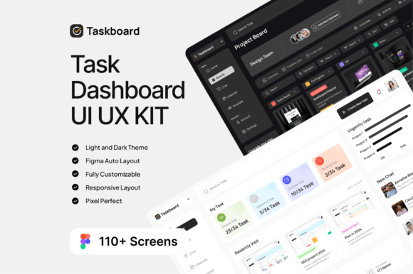
Taskboard: A Professional Task Dashboard UI UX KIT
Building a task management application or a complex dashboard from scratch is a massive undertaking. The sheer number of screens, states, and components required can quickly become overwhelming, consuming valuable time and resources that could be better spent on user research and core functionality. This is where a well-crafted UI Kit becomes an indispensable asset for any designer or development team. The Taskboard - Task Dashboard UI UX KIT is designed to solve this exact problem, providing a comprehensive and meticulously organized foundation for creating sophisticated, user-friendly project management interfaces.
A Deep Dive into the Taskboard UI Kit's Visual Character
At its core, the Taskboard UI Kit presents a clean, professional, and highly functional aesthetic. It avoids trendy, fleeting design fads in favor of a timeless and intuitive visual language. The style is decidedly modern, characterized by clear typographic hierarchy, ample white space, and a structured grid system that ensures information is digestible at a glance. The personality of the kit is one of efficiency and clarity; it feels like a tool built by and for professionals who value their time.
The kit includes over 110 screens, which is a substantial library covering a wide range of scenarios. You will find everything from simple to-do lists and Kanban boards to complex project timelines, team management panels, detailed analytics dashboards, and user profile settings. The inclusion of both Dark Mode and Light Mode is a critical feature, allowing you to cater to different user preferences and environmental contexts without additional design work. This duality also demonstrates a thoughtful approach to user experience, enhancing comfort and accessibility.
What truly sets the Taskboard UI UX KIT apart is its foundational build. Being 100% Figma-based and vector editable, every single element is scalable and customizable. The layers are exceptionally well-organized and named, which is a dream for any designer looking to modify components or extend the system. You can effortlessly change the entire color scheme to match a specific brand identity, swap the free Google Fonts to another sans serif font or serif font that better fits your project's voice, and rearrange layouts to suit your unique information architecture needs. This level of flexibility makes it far more than a static template; it's a living design system you can own and evolve.
Practical Applications and Strategic Value
The utility of the Taskboard - Task Dashboard UI UX KIT extends across numerous professional domains. For startup founders and entrepreneurs, it’s a powerful tool for rapidly prototyping a minimum viable product (MVP). Instead of spending weeks on initial UI design, you can have a clickable, high-fidelity prototype ready for user testing in a matter of days. This accelerates the feedback loop and allows you to validate your product concept with real users much faster.
UI/UX designers can leverage this kit as a robust starting point. It provides a solid structural backbone for projects in the SaaS, productivity, and enterprise software spaces. By using the pre-built components, designers can focus their creative energy on solving unique user flow challenges and refining micro-interactions, rather than reinventing basic elements like buttons, forms, and navigation bars. It’s an excellent asset for building a consistent and scalable design system for a larger application.
For marketing teams and content creators, the dashboards within the kit can be repurposed for creating compelling social media graphics, blog post illustrations, or website hero sections that showcase data-driven results. Imagine using a beautifully designed analytics chart from the kit to visualize your campaign's success in a presentation or a social media post. This adds a layer of professionalism and visual appeal that generic stock photos cannot match.
Integrating the Kit into Your Workflow
Getting started with the Taskboard UI Kit is straightforward, thanks to its Figma-native format. The included guide for design system compatibility is a valuable resource, offering insights into how the components are structured and how to best utilize them. Before diving into customization, take time to review the existing style guide. Understand the typographic scale, the color palette logic, and the spacing system. This foundational knowledge will ensure that any modifications you make remain harmonious with the overall design.
When evaluating how the kit fits your project, consider the nature of your data. The provided layouts are optimized for task and project management, but they can be adapted. For a more data-heavy financial dashboard, you might need to introduce more complex charting components. For a simpler to-do app, you might strip away some of the more advanced modules. The key is to see the kit as a flexible library of design assets, not a rigid, unchangeable final product.
One of the most practical pieces of advice is to test font pairings early in your process. While the kit includes excellent modern typography choices, swapping the primary typeface can dramatically alter the application's feel. A geometric sans serif font conveys efficiency and modernity, while a humanist sans serif might feel warmer and more approachable. If your brand uses a specific display font for headings, try integrating it to see how it pairs with the body text styles provided. The vector-based nature of the kit makes these typographic experiments simple and non-destructive.
Ultimately, the Taskboard - Task Dashboard UI UX KIT is a professional-grade resource that respects your time and elevates your work. It provides the visual polish and structural integrity needed to build credible, user-centric digital products. By starting with a strong, customizable foundation, you empower yourself to create more thoughtful, consistent, and effective user experiences.